
Clear Digital is a founding member of Myrious Group's expertise-driven agencies.
Myrious Group is an independent holding company enabling forward-thinking brands to achieve breakthrough performance through power of orchestration.
Visit Myrious.com

"Users of any application expect consistency and unconsciously look for patterns. This is extremely important to keep in mind when designing components for a set of applications that might be used together and are delivered from a single company like Citrix."Danny Halvorson Creative Director
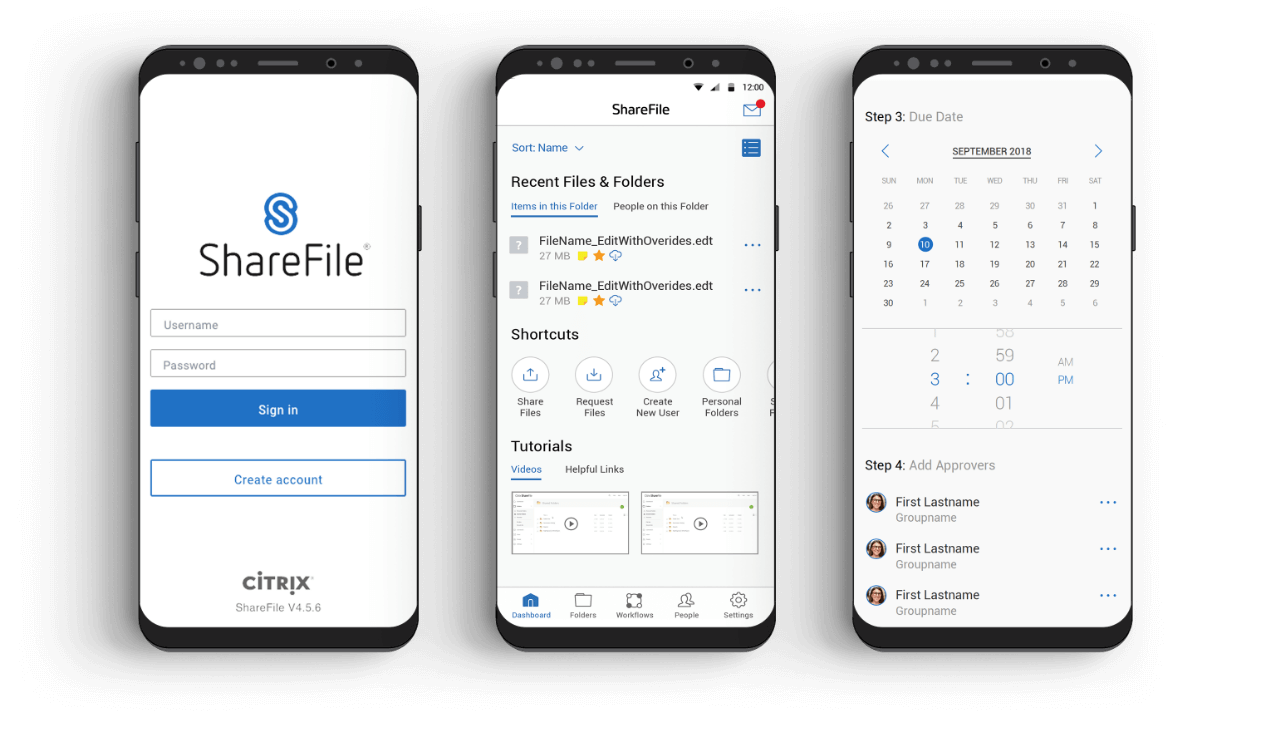
As the first point of contact, it’s important that Citrix login screens look and feel the same across solutions. Clear Digital created a simple, clean login screen using the brand palette. It’s a strong visual cue that reinforces the Citrix brand on any device or app.
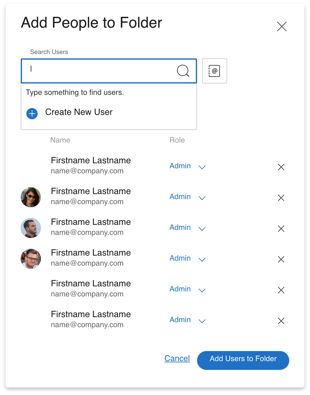
After identifying which functions are repeated across Citrix apps, Clear Digital got to work defining and designing the core UX principles. This allows Citrix dev teams to reference visual specifications and standards when adding components like search windows, people finders, and accordions. Now they can easily recreate designs for a coherent experience.
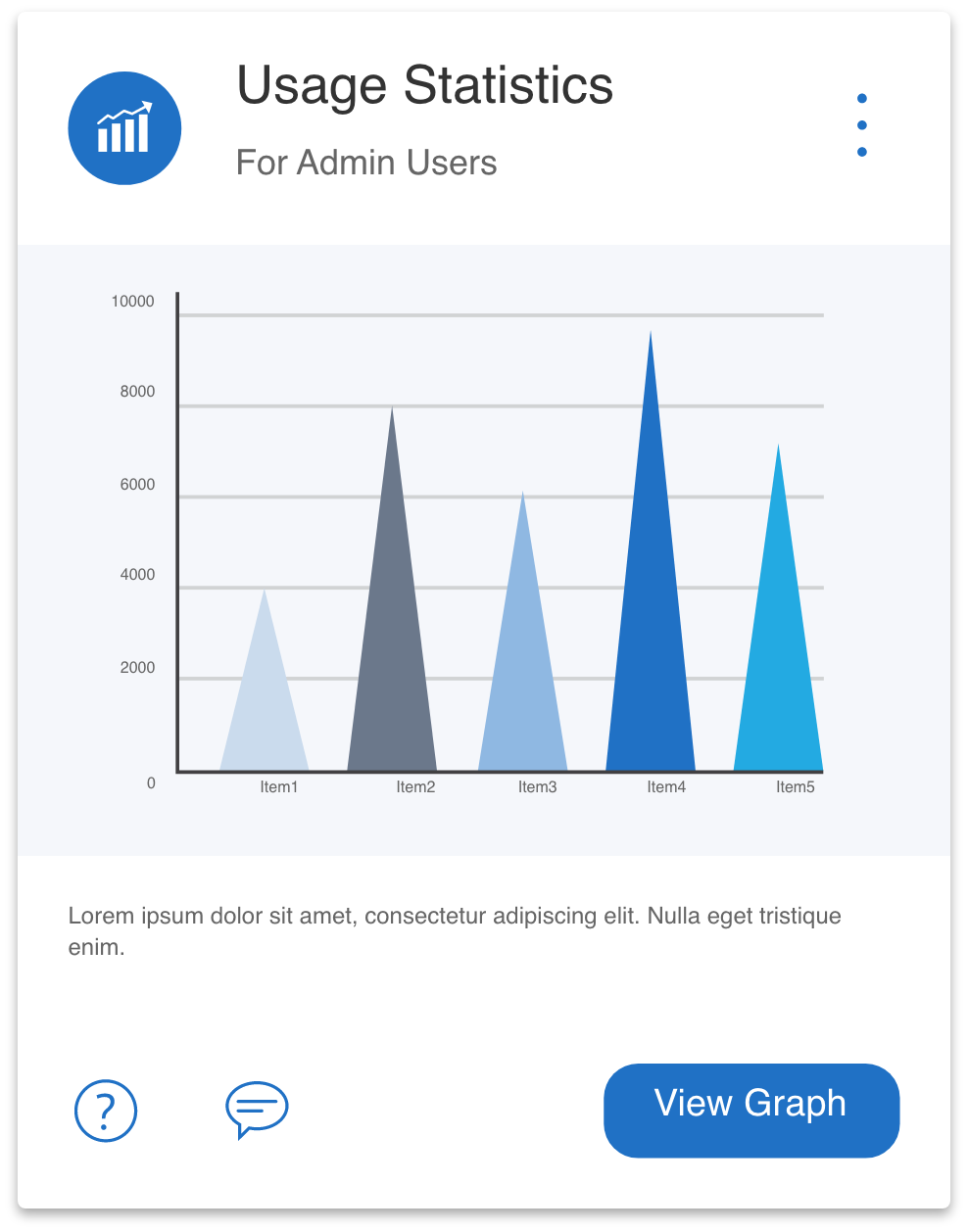
Next, we added all the other components that are shared across solutions—from every type of button to icons, card designs, and eyebrows. Any element a Citrix app could need has a clear visual guideline, contributing to the customer-centric simplicity and unifying the brand experience.
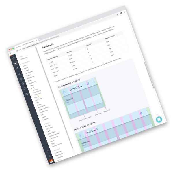
To make sure Citrix can share the up-to-date pattern library with whoever needs it, we chose Frontify—the online brand management platform. Anytime an element is updated, designers and developers will have that latest iteration at their fingertips, accessible from anywhere. This empowers Citrix to maintain a consistent UX as they continue to grow and evolve.
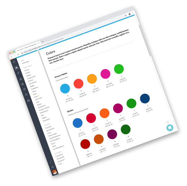
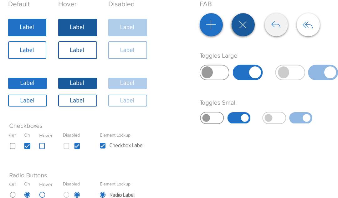
As part of standardizing design elements, we took the brand color palette and came up with new colors to specify design systems and app functions—for example, yellow for warnings, red for highlight states, and so on. We also tested each colored component and contrast for WCAG2 accessibility, in compliance with ADA guidelines.
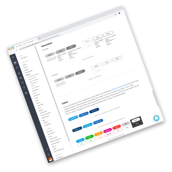
As one of the most important components users interact with, defining the use cases, various states, and visual guidelines for buttons is vital to unifying the digital experience—and making it customer-centric. Clear Digital chose simple, clean design to help guide users through Citrix apps in a way that’s intuitive and visually compelling.
Many Citrix apps are primarily used on mobile devices. To ensure users have an optimal experience on both iOS and Android, Clear Digital designed mobile screens for the different core systems. Beyond responsive, it’s made for a mobile-first world—part of the Citrix promise to power a better way to work.
Share your project details. We want to hear all about what you need.
Clear Digital is a founding member of Myrious Group's expertise-driven agencies.
Myrious Group is an independent holding company enabling forward-thinking brands to achieve breakthrough performance through power of orchestration.
Visit Myrious.com
© Copyright 2024 Clear Digital, Inc., a Silicon Valley / San Jose Web Design Company. All Rights Reserved.