The Cohesity platform leads a highly specialized industry: hyperconverged secondary storage at web scale. It’s both a complicated technical story and a straightforward benefit story which made their web presence critical to clarifying and positioning them for the future.
Cohesity helps businesses not only protect their most important data but make it productive too, by consolidating and simplifying data center and cloud management. But the company needed a little help defining their vision. They came to Clear Digital to get a jump on the competition and help visitors easily understand what their solution does and the benefits it delivers.
Design with purpose
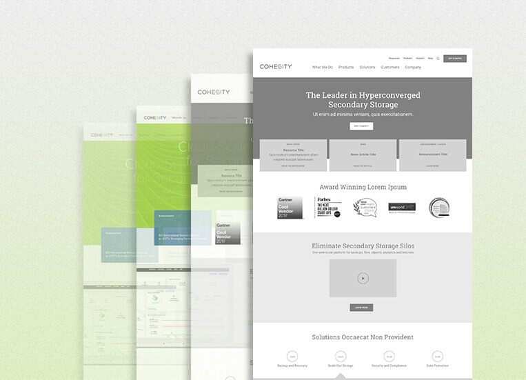
The first step was designing the information architecture to show visitors the detail they want, generate leads, and demonstrate Cohesity’s focus as a software company versus their hardware roots. Designer Valerie Ouano says, “We wanted to design it to make it clear to users right away what it is they do, which is very technical.” This includes the tech gurus who speak hyperconverged secondary data storage lingo, and the operations folks who are focused on driving business efficiency. We started by creating a sitemap to account for all the pages and decide where they should live.
Development
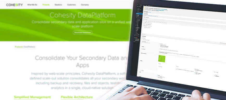
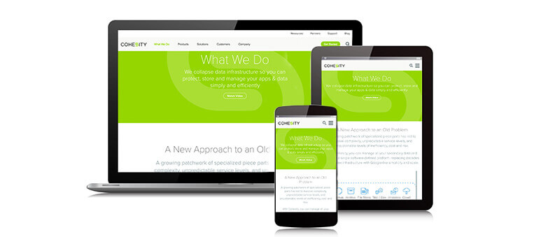
The Cohesity site is hosted on Pantheon, and our team used WordPress CMS with Marketo integration to implement changes. We got to work on the homepage first, redesigning it to to build credibility by displaying the many awards and accolades Cohesity has won. We added similar blades throughout to share Fortune 500 customer testimonials, analyst rankings, and other resources that speak to the impact they have. We also added new pages, including the Vision and Why Cohesity pages, which entice new leads by defining who they are, what they do, and why you should use them. And to help people see how their solutions actually work, we included lots of screenshots throughout the site showing their software in action. This gives users an immediate sense of what the solution looks like—clean, clear, and precise.
Branding and style
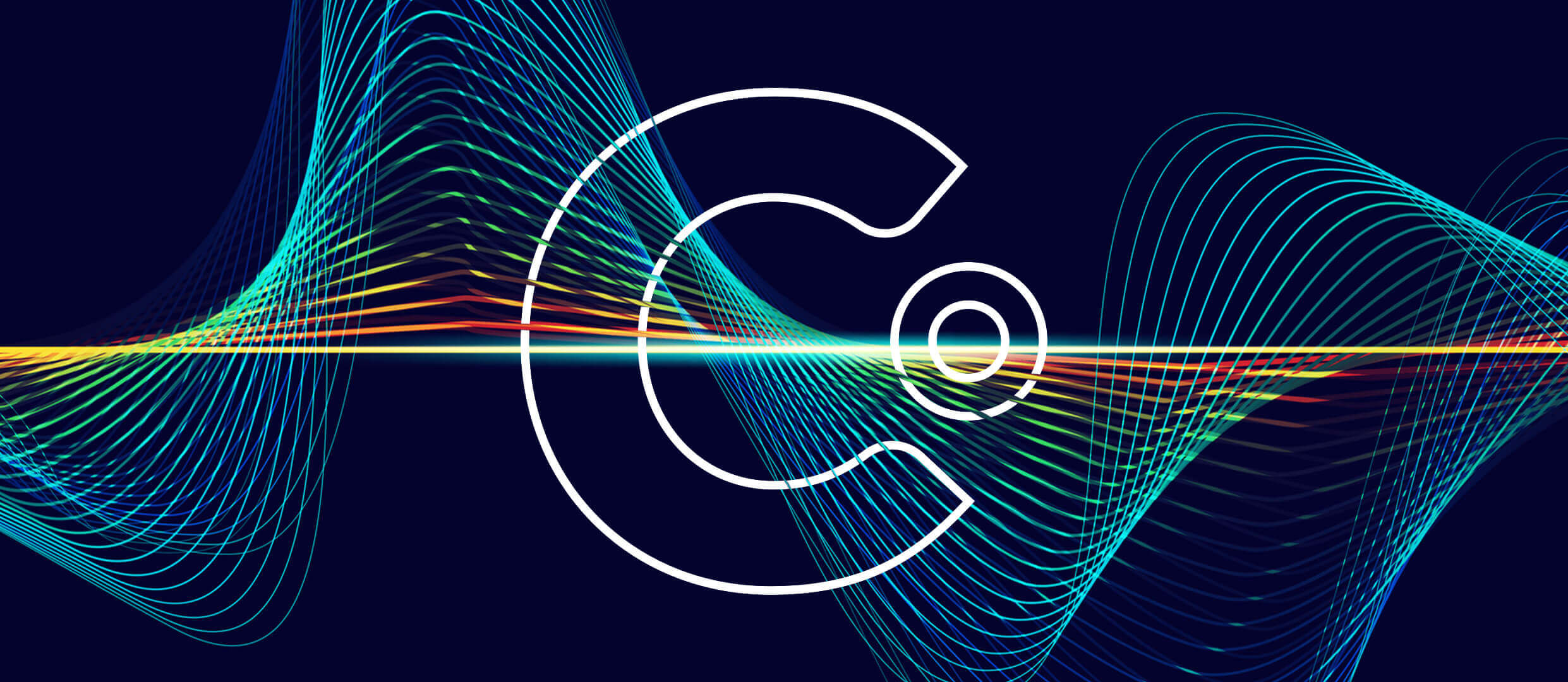
To make Cohesity feel bigger (and edgier) we needed to revamp the site’s aesthetics. They didn’t have a lot of brand elements in place, so we started by taking the interlocking “s” from their logo and translating it into a lines and dots wave pattern that we showcased throughout the site. This ties into the consolidated insight and metrics the Cohesity platform provides for customers, and gives it an expansive, modern feel. Throughout the website we maintained the established iconography style, integrating it into it the sleek new design.
Rolling it out
Doing a redesign like this that’s really aimed at redefining not just your image but also your message can be tricky, because it forces the client to think about what story they want to tell. To support Cohesity throughout this process we took a phased approach, launching the homepage first with the original header and footer. This enabled Cohesity to get a jump on the relevance factor while maintaining familiarity. Next we launched the new pages and the updated header and footer. We’re continuing to tweak the navigation and roll out new pages, and we’re excited to begin work on the final phase, which will involve rebranding the About Us section.
From web design, CMS websites, applications, ecommerce, motion graphics and multimedia, graphic design, and print, to Internet marketing solutions, we’ve got you covered.
Get our latest news, insights, and project spotlights delivered directly to your inbox.
* We are the sole owners of the information collected on this site. We only have access to/collect information that you voluntarily give us via email or other direct contact from you. We will not sell or rent this information to anyone.